The funny thing about career websites is nobody actually wants to be on one.
That's just the inherent nature of talent acquisition, and it's something the best career websites understand well. As much as you might try to glamorize the application process and make it as seamless and stress-free as possible, there still isn't a candidate out there who would describe looking for a job as "fun." Getting hired is fun. Starting a new position in a new office (remember those?) is fun. Doing rewarding work is fun.
Wading through job postings and tedious nav menus? Not so much.
I'm going to be real with you: While career websites are tremendously important to businesses and talent acquisition teams, they're simply a means to an end for a candidate. Yes, they should tell your company story, express key brand values, and exude transparency and honesty of what working at your business is really like Ñ but above all else, they should allow people to find and apply for the right job as easily as possible so they can move off the career site and on to the next step.
If your career site isn't doing that, you're putting up unnecessary road blocks for your potential hires. And you're adding to the unfunness.
The best career sites quickly, almost effortlessly, convey what it feels like to actually work at a company through the use of customer stories and visual content, and give candidates the power and flexibility to search and apply for openings on their terms. And while they might not exactly be "fun," they're definitely experiences that candidates will remember positively.
Chili's - Jingle all the way.
Quick, close your eyes and picture Chili's. I'm guessing you immediately started to hear this funky little ear worm: "I want my baby back, baby back, baby back ..."
Lead with your best piece of content you only get once change to make a first impression.
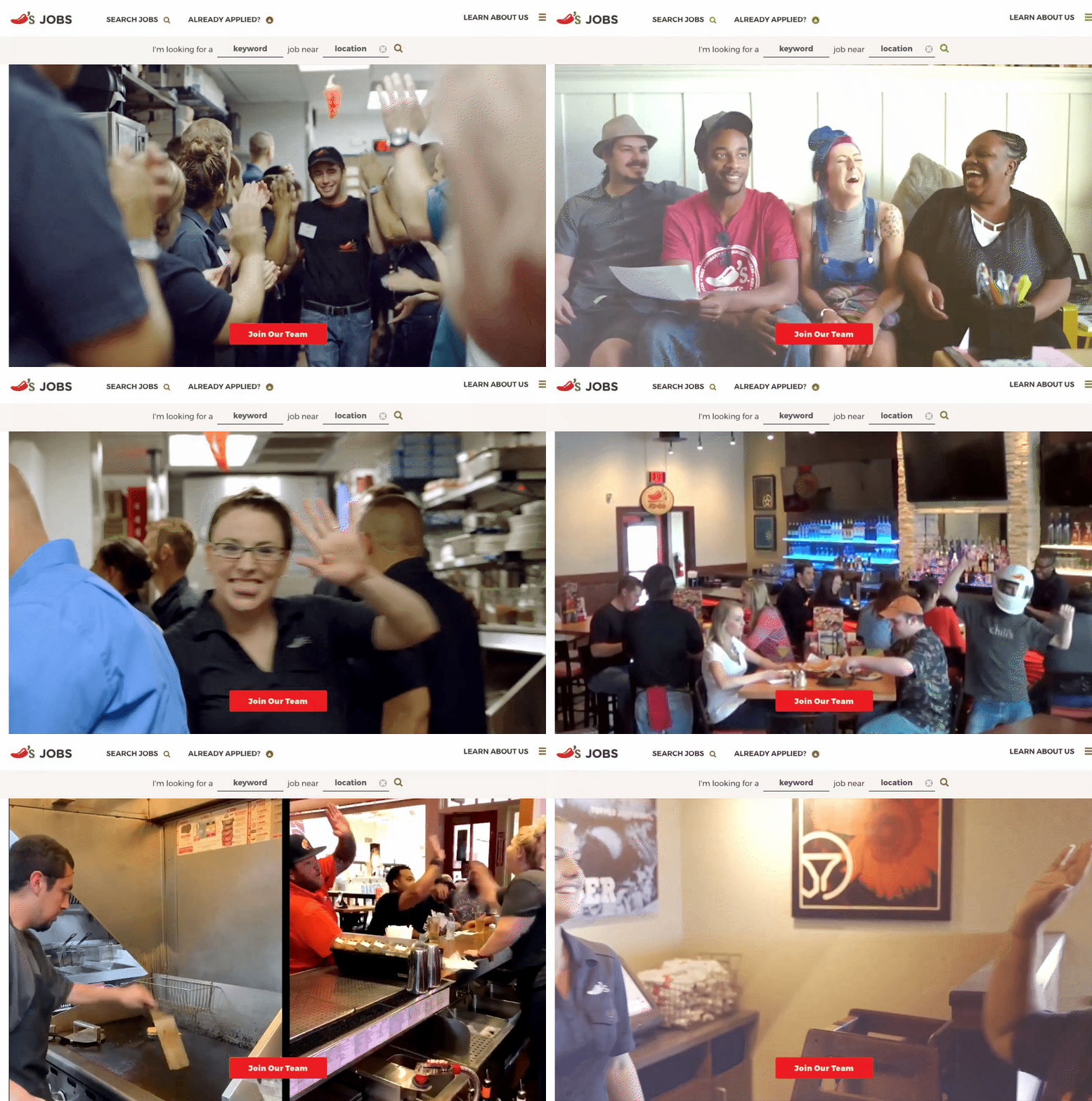
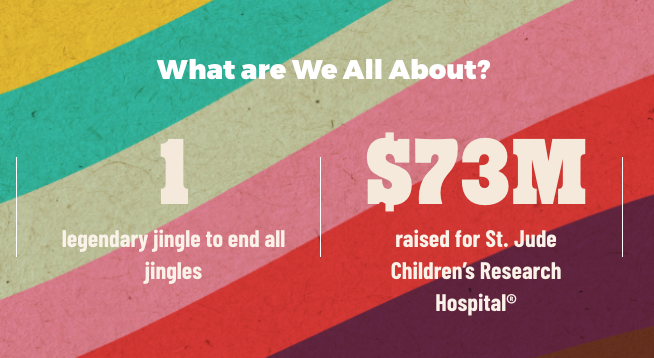
When people think Chili's, they think of that jingle. They think of casual nights out with the family, and smiling ear-to-ear, and letting the good times and bottomless chips and salsa roll. I think sometimes the best thing a company can be is self-aware and with their career site, Chili's displays that they know exactly who they are and what their candidates are looking for. The video they put front and center oozes warmth and authenticity, and all their supplementary content plays up their key values Ñ giving back to the community, a long history of service you can trust, and an inviting, inclusive culture.
And that jingle.
Funny and functional. Chili's does a great job of balancing humor and providing value.
All of it works together to breed familiarity and comfort. Candidates know exactly what they can expect on Day 1. Throw in the clear, clean CTA buttons and search options and you have a career site experience that delivers all the content a candidate needs but doesn't overstay its welcome.
Advocate Aurora Health - All about you.
A lot of people associate career sites with rejection. And I get it. I've been there. We've all be there. Looking for a job can be a lonely, alienating experience full of uncertainty. Honestly, most people just want to feel wanted by a company.
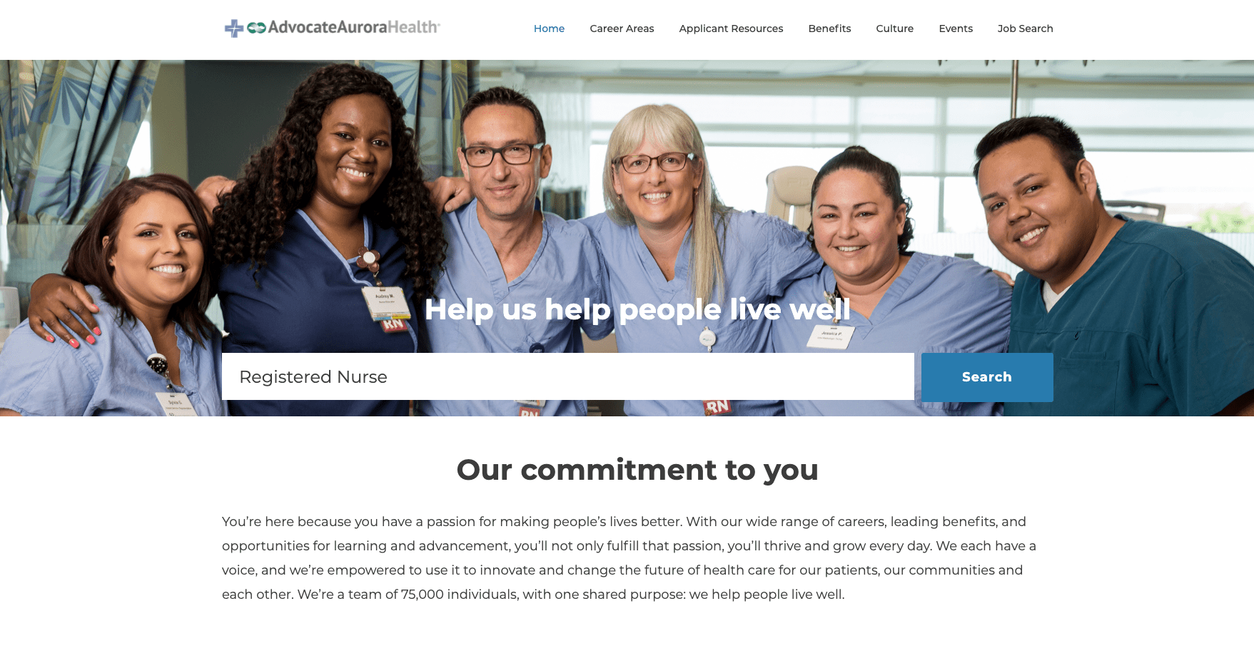
Look at the Advocate Aurora Health career site. They have five headers. Three of them contain the word "you."
Make it about your candidate, and make it as easy as possible to find jobs. Check and check.
This is a homepage that puts the emphasis and attention on the candidate; the imagery and messaging feels like you just opened a door and a bunch of your closest friends were waiting there to throw you a surprise party Surprise! We have a job for you!
Beyond that initial welcoming party, the site offers up every resource a candidate needs in an easy-to-find format: benefits, events, culture, plus a detailed description of what it's like to work in each specific career area with a quote from a current employee.
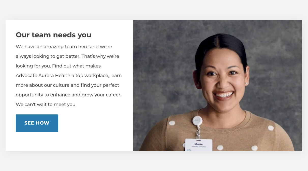
The best career sites feel like a personal invitation, not a business transaction.
Advocate Aurora's strategy here makes it so easy for candidate's to visualize themselves working there Ñ and to feel like they belong.
Edward Jones - Dang, that was easy.
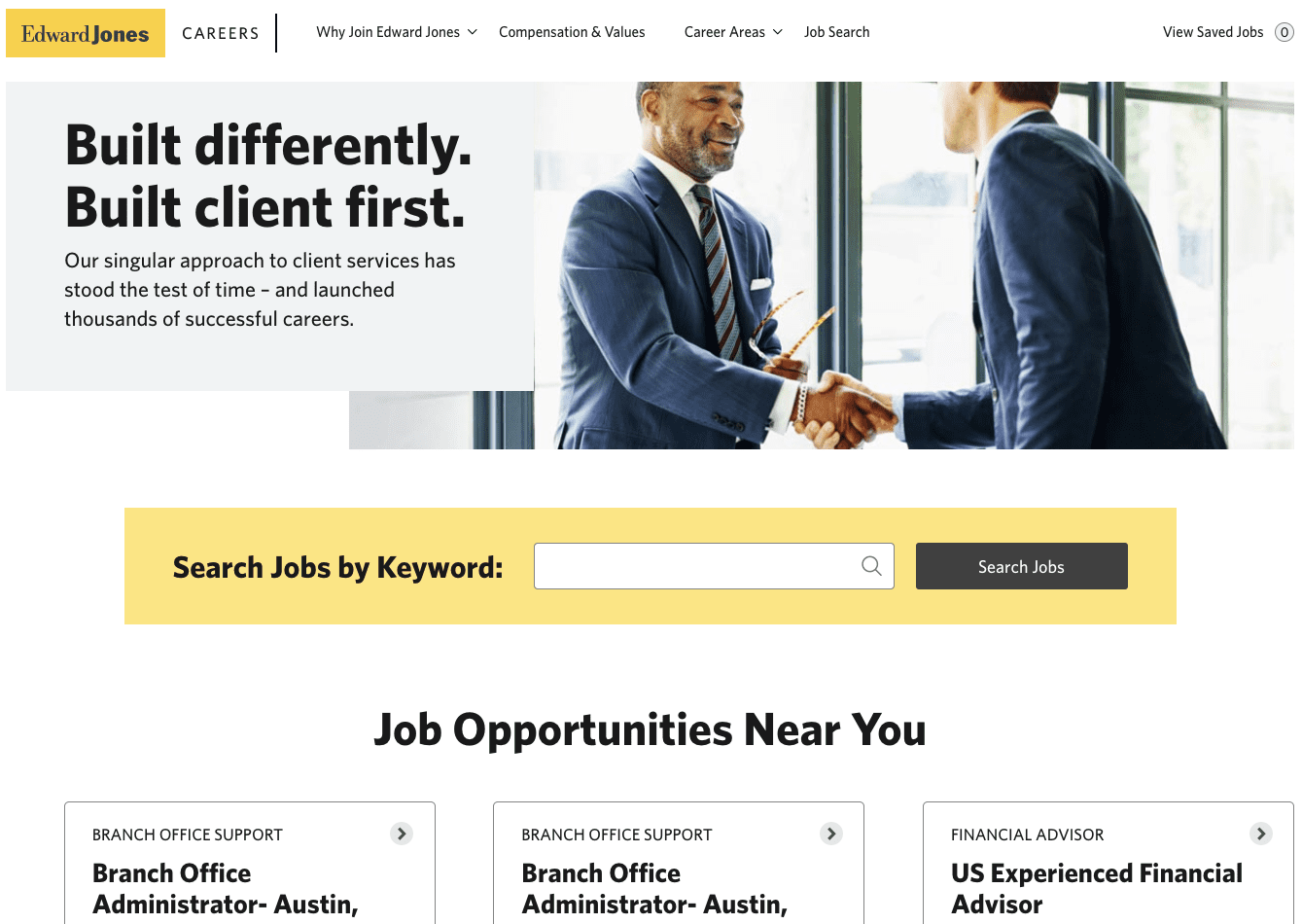
As a financial expert, Edward Jones is all about making complicated things easier. Their career site is no different.
Seriously, this is a homepage where you really don't even need to scroll below the fold. Everything you need to apply is right there. And that's the mark of a great user experience additional information and resources are available, but they aren't getting in the way or being intrusive.
Strong messaging, search functionality, and available jobs by region. It's all here.
Most people likely already have some previous knowledge of your company, anyways. That's why they're here. And even if they don't, a lot of candidates will just mass apply for anything available in their area in the field they're looking for, and then worry about educating themselves once the employer shows interest (I have 100% done this, it's just more economical).
Edward Jones does a great job of making applying simple but they also make it easy to find more info if need be.
Again, telling your story is vital. Your career site needs to do that, and do it well. But sometimes all the extra bells and whistles can get in the way of the number one question candidates are looking to answer when they hit your career site: Do you have a job for me?
Edward Jones answers that in a millisecond yes we do.
Scripps Health - Never lose your way
To paraphrase one of my favorite Quentin Tarantino movies (hint: it's the one with all the gratuitous violence and title cards), the candidate experience is never a straight line. It's a forest. And like a forest it's easy to lose your way. To get lost. To forget where you came in.
(This admittedly sounds a lot cooler coming from a legendary Japanese sword maker instead of me, but you get the point).
Many, many candidates will make it to your career site, apply for a job with your company and then, unfortunately, be lost in the ATS abyss. And that's why talent networks are so important. It takes all the candidates you never hired and turns them into an active, engaged audience. Scripps Health does a comprehensive job of explaining all the different content pieces a candidate will receive once signed up, and promises to tailor the experience based on their personal job interests.
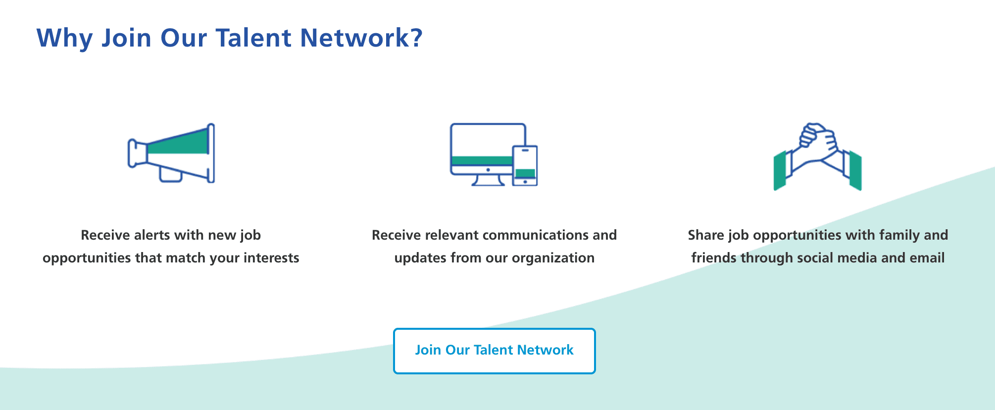
Sending your talent network a full range of content is the best way to keep them engaged and informed.
They even take a more modern approach by giving candidates the option to opt into notifications via text on mobile devices. This is an expansive, always-on approach to pipelining that takes the career site experience beyond the career site, and allows you to keep tabs on a candidate until they're able to find the right fit no matter how long and winding the path may ultimately be.
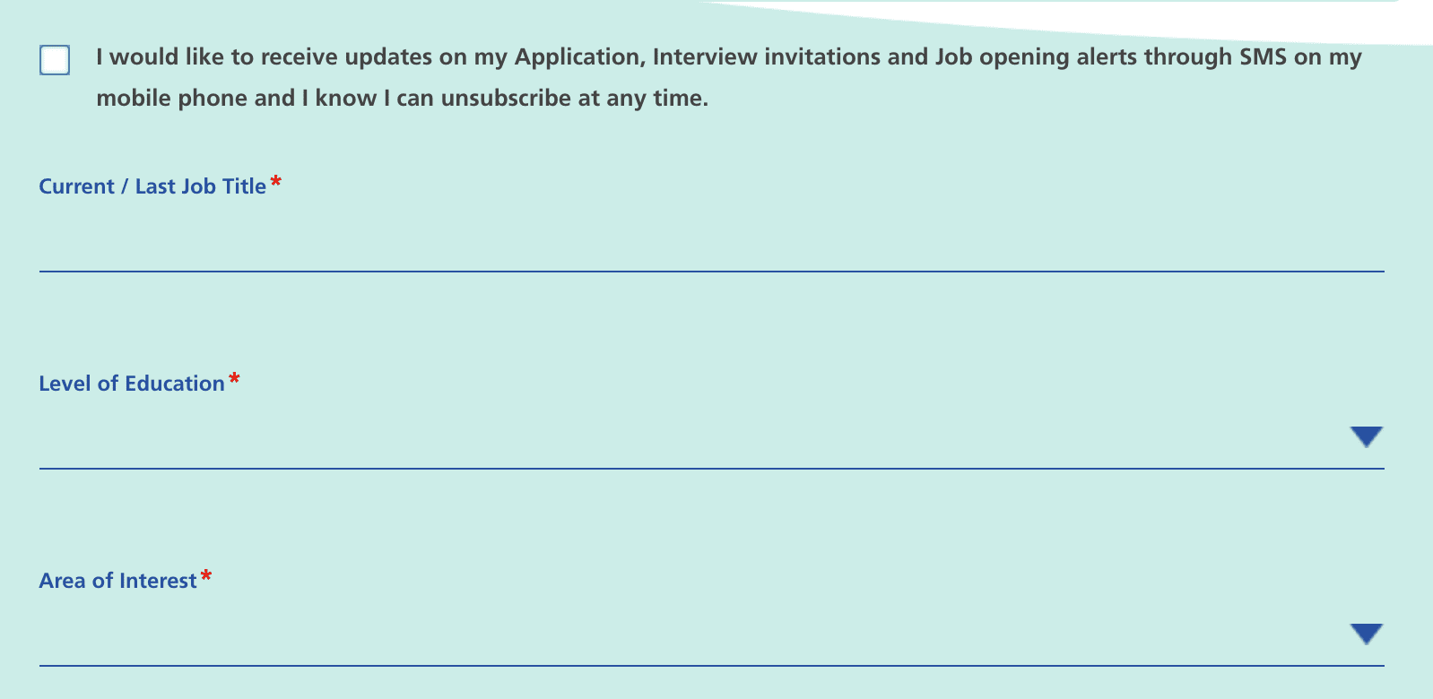
Text alerts is a smart way of reaching candidates where they are.
What can we learn?
A great career site can come in a lot of different forms but yours should represent not only who you are as a brand, but also the values of your ideal employees. Be real. Be honest and transparent. And for crying out loud, only be as wordy and descriptive as you need to be. Tell your story and show off your personality, but don't let it get in the way of the most important thing on your career site: the jobs.


