Pop quiz: How did you get here?
I'm not talking "Adam and Eve" or "chicken or the egg" type existentialism. I mean, what was your experience navigating to this blog post? I bet it was so seamless you barely remember. But it probably went something like this:
You picked up your smartphone or MacBook, typed a search query into Google (wow, that was easy and totally not annoying), clicked on a headline that looked interesting (I wrote that by the way), and, voila, we're three paragraphs in.
Easy. Second nature. You might even call it fun.
And you know what, the technology we use every day should be fun. And useful. Unfortunately, that's not always the case. When it comes to talent acquisition, each open corporate job attracts 250 resumes, and that means teams interact with hundreds of candidates and applicants a day. The right technology can make these interactions seamless, actionable, and enjoyable ... but most recruitment marketing platforms, CRMs, and ATSs our recruiters use look painfully antiquated like they're powered by Microsoft Paint and a hamster wheel.
How can we expect recruiters to work (and flourish) in software that feels like work when literally none of their other technology does?
Talent acquisition technology design matters and it starts with user experience (UX) and user interface (UI). The stats that prove it:
- Judgments on brand credibility are 75% based on website design
- Almost 40% of users will completely stop engaging if they dislike the content or layout of a platform
- Here's the kicker: research shows that, on average, every $1 invested in user experience (UX) brings $100 in return
Yup, you're reading that calculator correctly that's a 9,900% ROI.
UX and UI are so much more than just making things look cool (although that's certainly a plus). Investing in how our talent marketing platforms are designed will directly impact usability, which powers adoption and your bottom line.
We need to start thinking about how our tech is built to work for us from a design perspective and how it can empower our recruiters from a data perspective.
Your tech should put people first
I'm a content guy at heart, so naturally, I was pretty excited when I saw the design direction for SFX, our new talent marketing platform. It's bold and playful yet elegantly minimalist.
It truly doesn't look like anything else in the industry so much so that I was curious as to how and why our creative team landed on this direction.
So I decided to chat with Gunnar Kiene, Symphony Talent's chief creative officer (who has a ton of experience in product design and consumer advertising), to learn more about his approach to designing the SFX UX and UI.
What I learned: The focus wasn't on the tech itself. It was on the people who use it.
"We decided to challenge the norm of something that has always been so impersonal and compliance-driven in talent acquisition and recruitment marketing, and make it more human," Kiene said. "So we asked ourselves: âHow do we humanize the journey, so talent leaders see candidates as more than just butts in seats? And how do we get candidates to think about a job as more than just a paycheck?'"
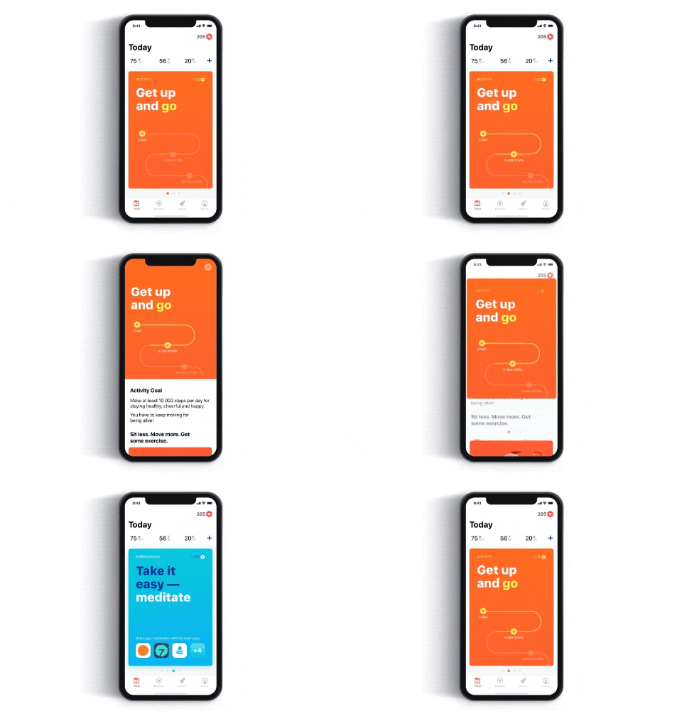
By using basic design principles inspired by best-in-class brands like Apple and Google (the perfect crossroads of memorable yet minimal), and reducing friction points and barriers between recruiters and talent, Kiene and his team created a UX and UI that will seamlessly drive adoption every day.

Good UX/UI from brands like Apple makes information easy and fun to consume.
So what does that look like? Personality and purpose.
- An interface that is bold, bright, and conversational
- A dashboard that has a widget-based template for different types of users but is also completely customizable based on what you use more
- Use of color is cohesive but has personality, helping you immediately understand status or results
- Navigation and information hierarchy is streamlined, prioritized, and digestible
- UX works for you, automating easy tasks and gamifying progress that would otherwise feel mundane
A product that checks all these boxes is a product that recruiters will want to engage with and explore more of and the more they use it, the more they'll understand all its capabilities.
That leads to more user data, more interaction with candidates, more touchpoints, and yup more talent and brand engagement for you.
You can. But should you?
Our 2020 Recruitment Marketing Benchmarks Report revealed that of the employers with talent networks, only 10% leverage CRM automation to send email reminders to complete an application, and just 8% send content other than jobs.
There are various factors why these stats are shockingly low, like lack of resources, lack of recruitment marketing skills in-house, and lack of strategy. But I think a very likely reason has literally been staring us in the face: the UX of our talent marketing platforms is making recruiters' lives harder, not easier.
There are two critical ways to measure the value of UX:
- What it adds. It should create an experience around the actions recruiters take in the platform and the data it's tracking, empowering them to do more and guiding them to the logical next step. For instance, SFX can automatically send an email reminder to anyone who dropped off an application and then notify recruiters about it in the dashboard. That's added value every single day, not to mention freed up time for every recruiter on your team.
- What it removes. So much of what makes a platform easy to use is knowing exactly what to show and when to show it. Have you ever really thought about how your favorite app or streaming service functions? Probably not, because it works precisely how you expect it to, striking the right balance between attentive and absent. The best tech is the stuff we barely even notice: It doesn't bury us under the weight of buttons, cumbersome navigation, and outdated visuals. It's not in our way Ñ it's guiding the way and allowing us to make our next move intuitively.
And even though it seems like it would be easy to avoid bad UX/UI (it's pretty noticeable, after all) companies still lose $62 billion every year due to poor user experience.
"In creating the UX and UI for SmashFlyX, we wanted to demystify the process and hide information when you don't need to know it," Kiene told me. "We want to automate and power, but we didn't want SmashFlyX to be a black box, either. Could we have added more buttons and information? Sure, we can. But that doesn't mean we should. We present exactly what you need to make an informed decision and remove decisions we feel like you don't need to make Ñ and we always give you the understanding of why we made the decisions on your behalf."
If UX had a list of commandments, this would be number one: Focus on the needs of your users, and you'll get a product that's powerful and intuitive.
Hold your tech accountable
A recent study showed that 8 in 10 customers are willing to pay more for a better user experience. I'm willing to bet your recruiters, sourcers, talent marketers, hiring managers, etc., feel the same way. Honestly, when I saw what we accomplished with SFX, not only did I feel like I could have jumped in and started using it immediately, I actually wanted to.
You should be striving to create that feeling with your tech and your team, too.
Because if our tech doesn't solve problems simply and empower recruiters to do their jobs better, it's just not worth it. If our tech's UX/UI doesn't make work feel more human and fun and tasks easier to accomplish, then don't ask your recruiters to use it.
"We're in a human field, so let's humanize," Kiene said. "Companies are nothing, but people and most things in offices are just tools to facilitate collaboration and share information. With SFX, we created a platform that helps us get to meaningful human interactions faster."
Now, remember how you got here?
Good.
If you start holding your TA tech to that same standard of seamlessness and design style, you're going to see a major boost to ROI. Your recruiters will be more energized to dive into their work. Your talent will be more eager to apply and engage.
And, hey, you might even have some fun while you're at it.
The design elements to improve talent acquisition and recruitment marketing UX/UI or at least help us identify the good from the bad are literally at our fingertips. It's up to us to start using them.


